How we transformed a struggling fintech app into a user-loved finance companion

Project
Overview

How we helped Mydus Finance evolve from a functional but forgettable budgeting app into a brand people actually want to engage with. From a complete rebrand to a reimagined user experience, we turned financial management from a chore into something approachable.
The problem we solved:
Mydus had some traction but no identity, weak branding and confusing UX were killing retention.
How we solved it:
We rebuilt from the logo up: fresh brand foundation, then a rethought UX that guides instead of overwhelming the user.
together since:
2022
2024
Skills we flexed:
Method
Growth
Ux/UI Design
MVP
Webflow
Strategy
Branding
Mobile app screen showing financial dashboard with net worth, income, outcome, and stock performance for Spotify, Apple, Microsoft, and Tesla.

+65%

increase in user session duration after UX and UI redesign

+42%

improvement in onboarding completion rate

3x

faster time-to-value for new users reaching first budget setup

The Challenge

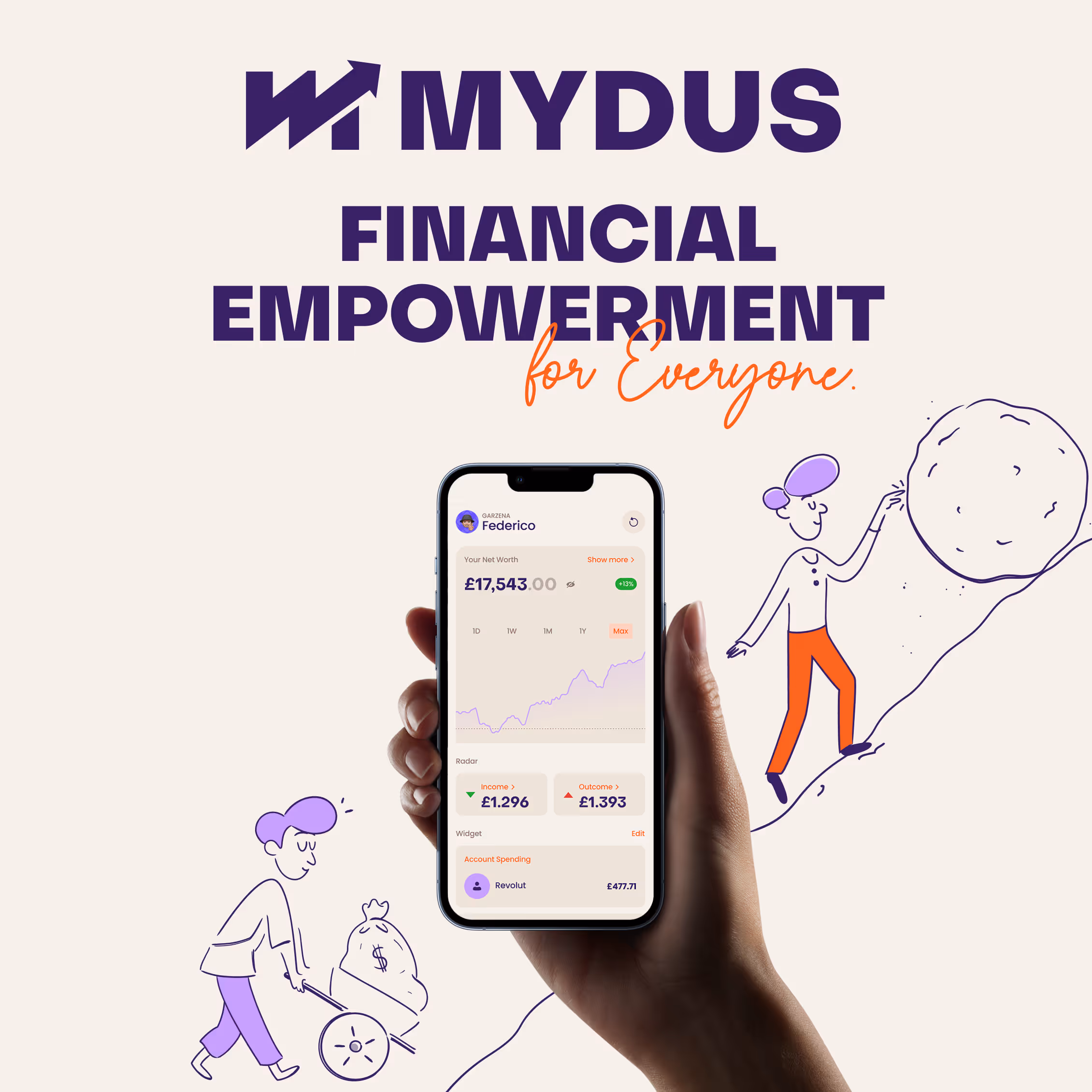
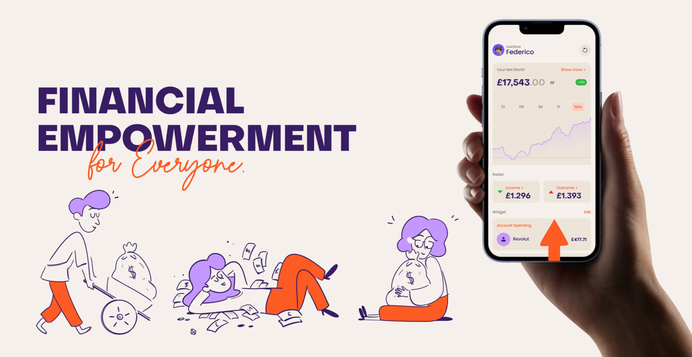
Mydus came to us with a working product that was failing to connect. The original logo felt generic, the app interface was cluttered, and users were dropping off before discovering the platform's real value. For an FCA-regulated fintech competing in London's crowded market, looking amateur wasn't an option, they needed a brand and experience that built trust while making money management feel effortless.

Split image of a smartphone showing two finance app screens side by side with a purple-haired character celebrating with a trophy on the right.Mydus app interface showing savings goal 'Travel the World' with £2,453 saved, started on 12/08/2023, monthly deposit of £24 into Revolut account.

Our Approach

We started where it matters most: the foundation.
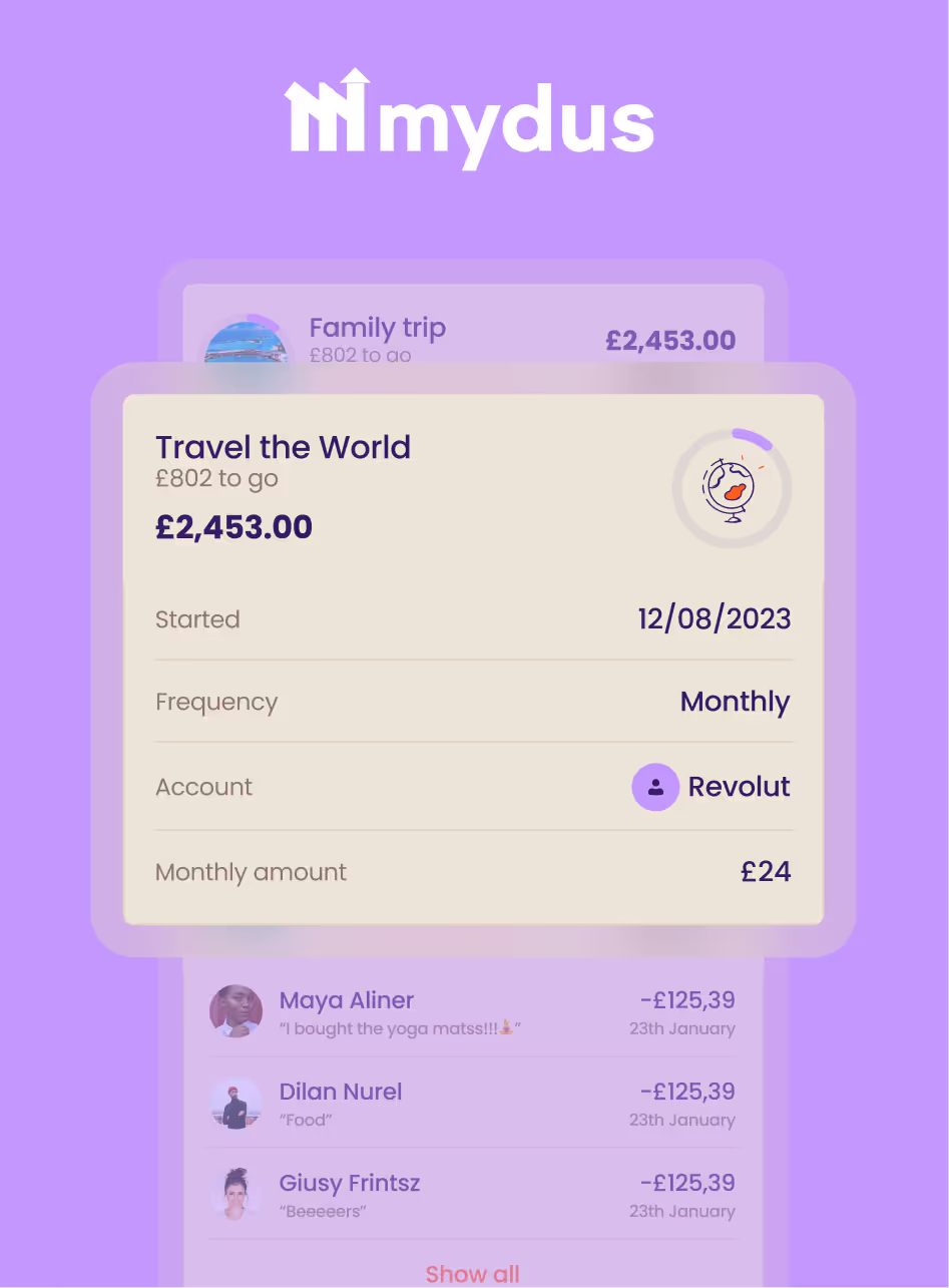
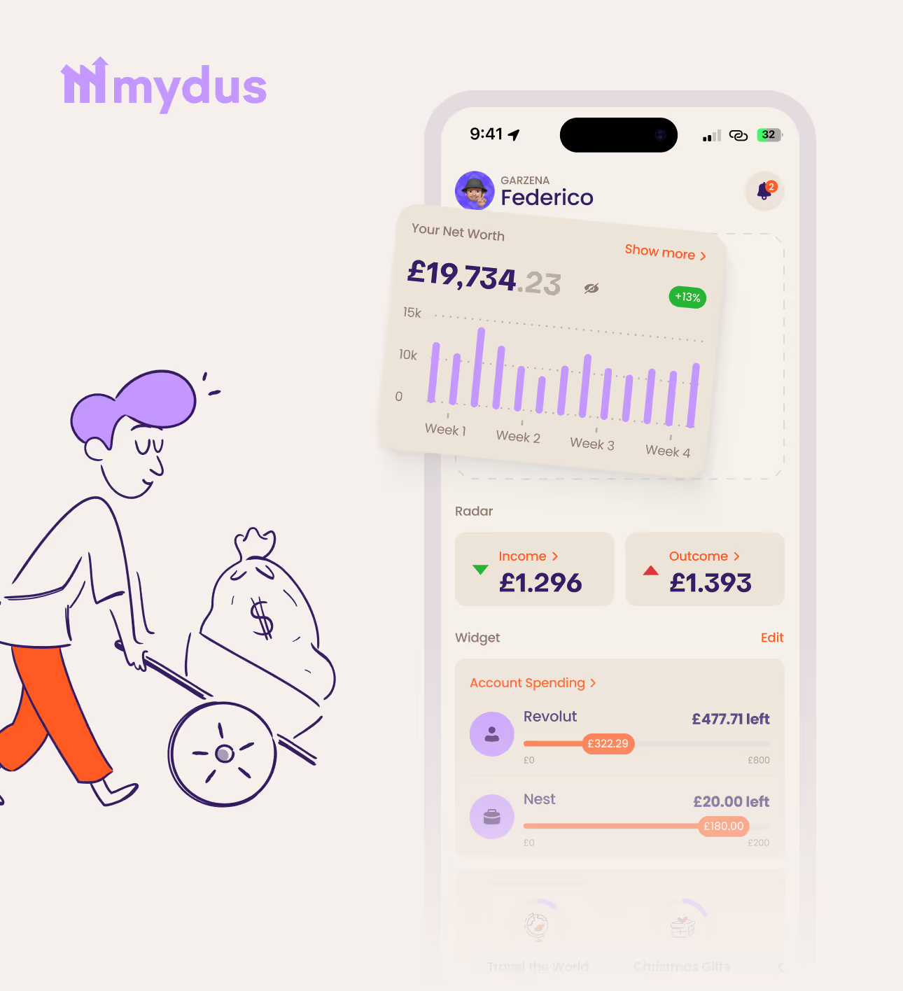
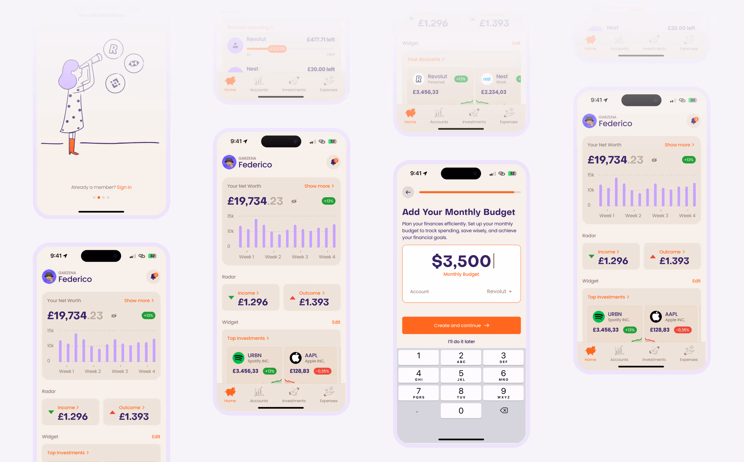
A complete brand identity, logo, color system, visual language, designed to feel secure yet approachable.

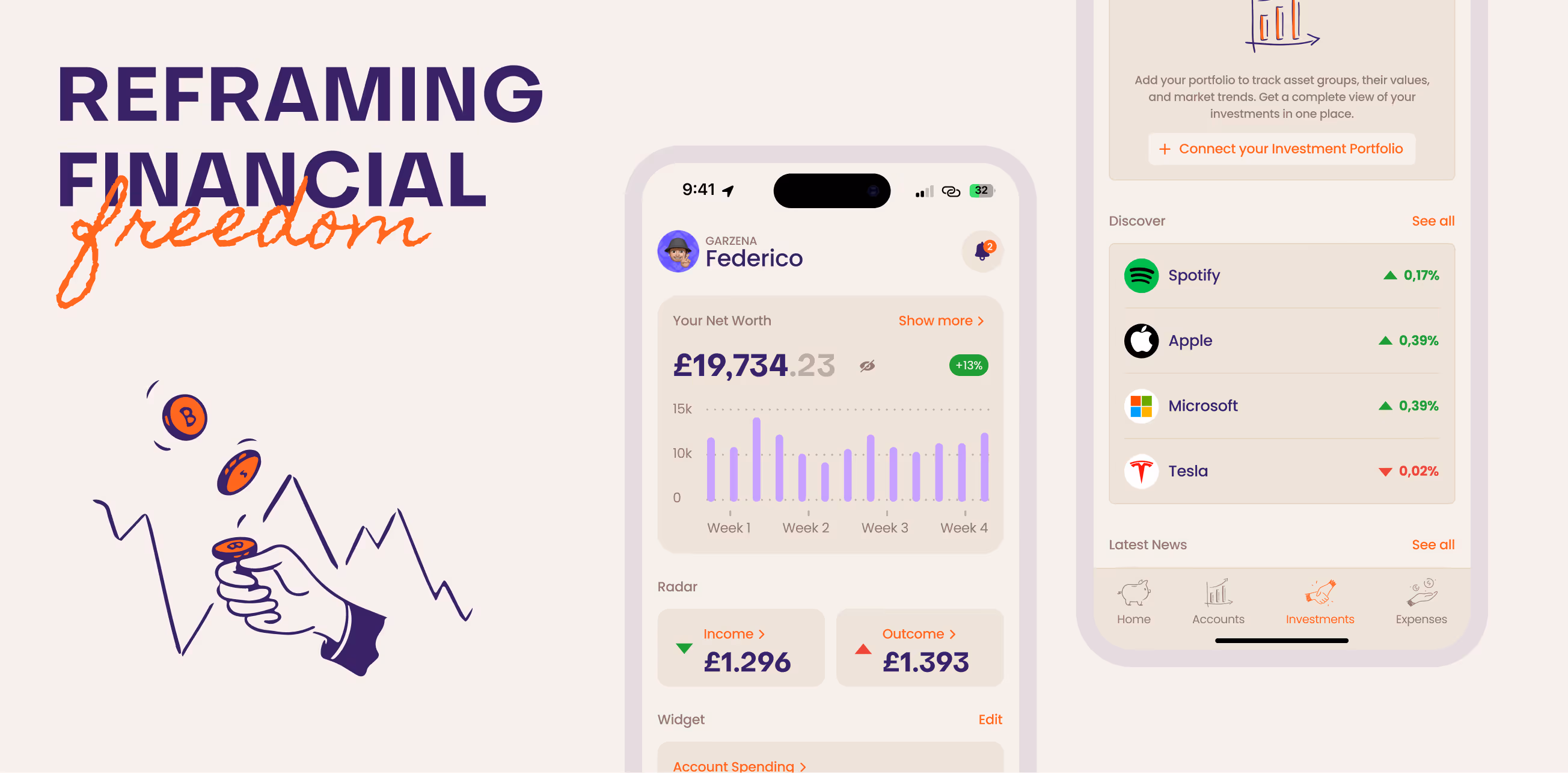
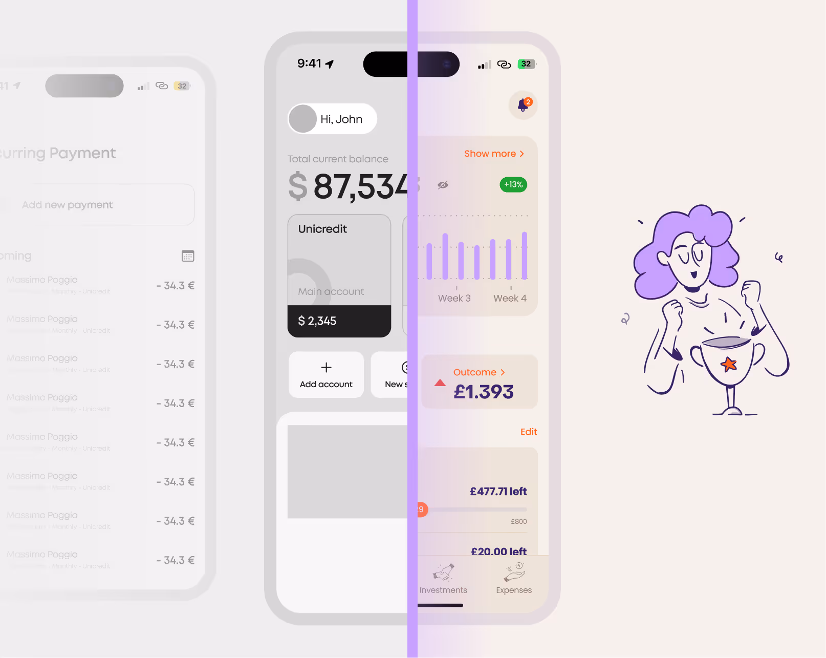
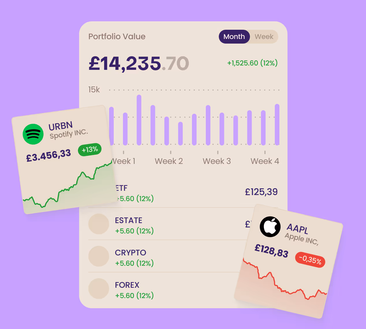
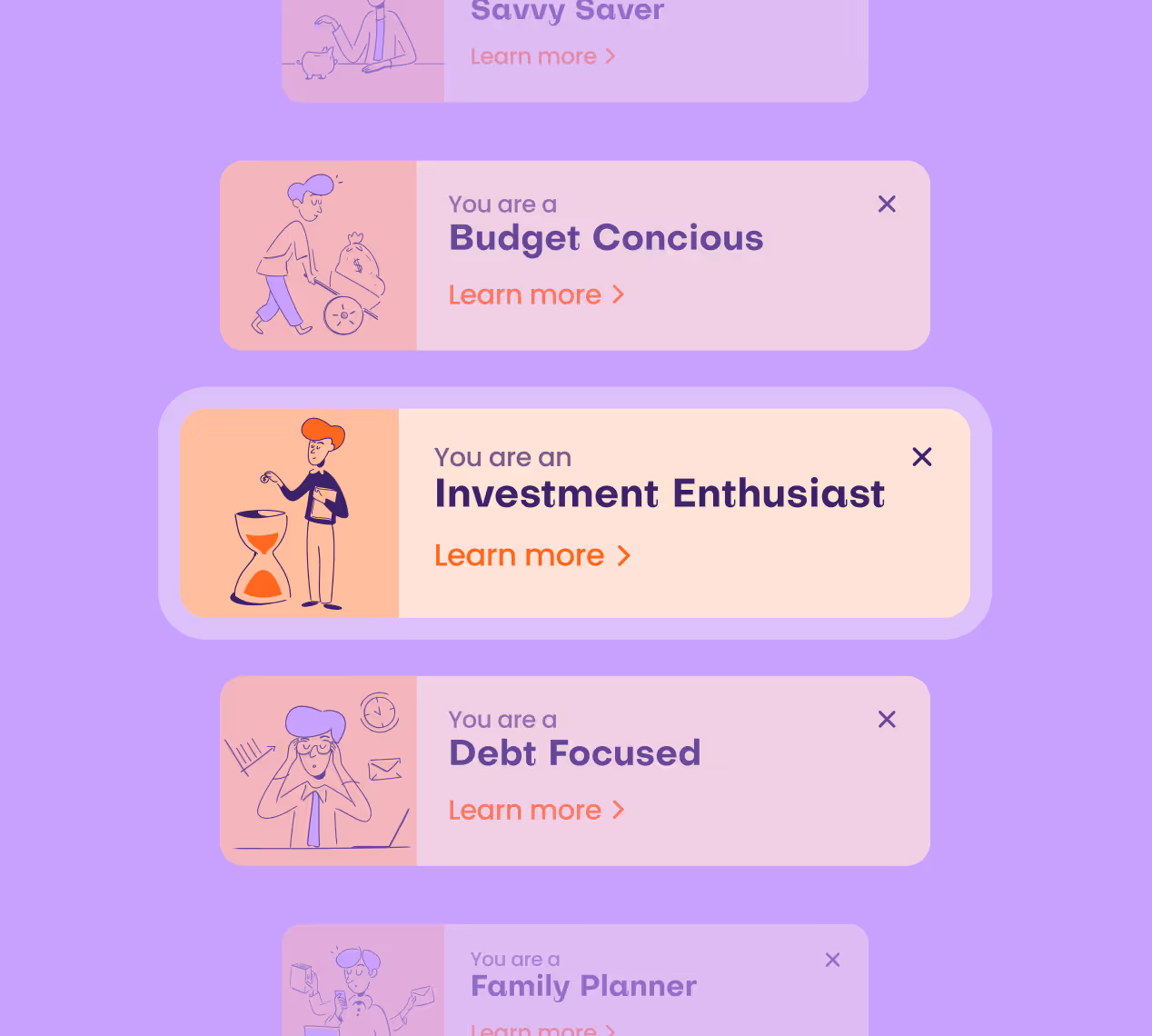
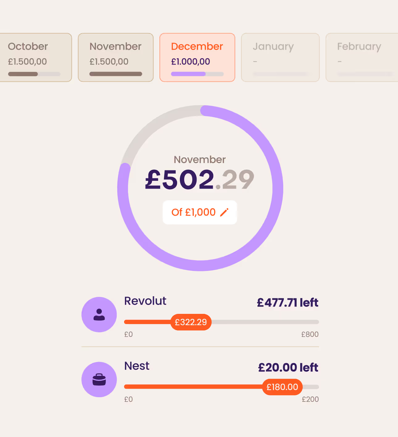
Then we mapped every user flow, identifying friction points that were killing retention. The redesigned UX prioritized progressive disclosure: showing users only what they needed, when they needed it. Shared budgets, saving spaces, goal tracking, we made complex features feel intuitive.

Finally, we extended the experience to their landing page, creating a cohesive journey from first click to daily use.

Mobile app screenshot showing financial summary with net worth £19,734.23, income £1,296, outcome £1,393, and account spending details for Revolut and Nest, alongside an illustration of a person pushing a wheelbarrow with a large money bag.Investment portfolio dashboard showing total value £14,235.70 with a 12% increase, weekly bar chart, and individual stock cards for Spotify with +13% gain and Apple with -0.35% loss.
Colorful financial profile cards showing different money management styles: Budget Conscious with person pushing a money bag, Investment Enthusiast with person next to hourglass, Debt Focused with worried person by laptop, and partially visible Family Planner card.Financial progress dashboard showing November spending of £502.29 out of £1,000 target, with Revolut and Nest accounts displaying remaining balances and spent amounts.

The Outcome

Mydus transformed from a forgettable finance tool into a brand users genuinely trust and enjoy using. The new identity gave them credibility in a competitive market, while the reimagined UX turned casual users into engaged ones.
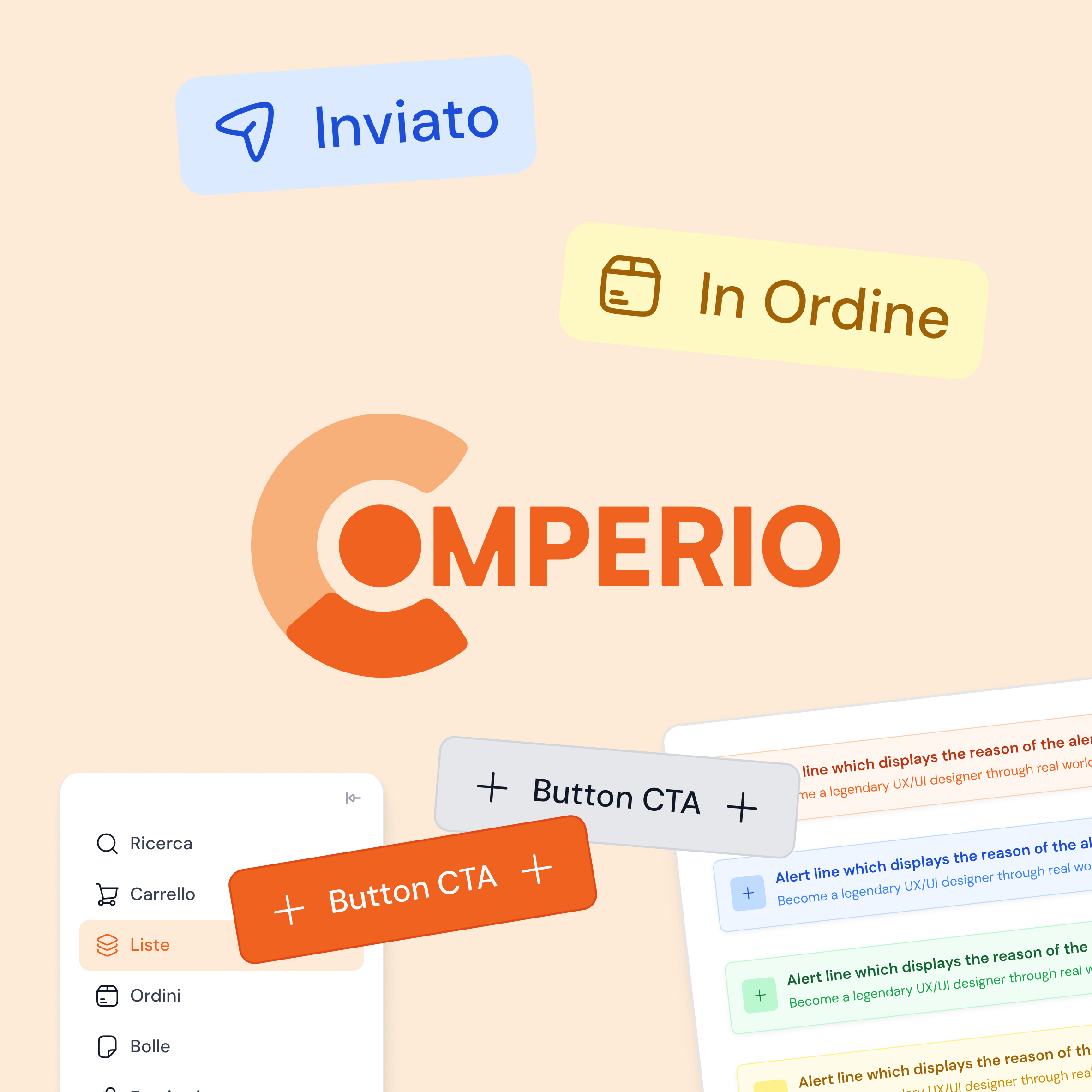
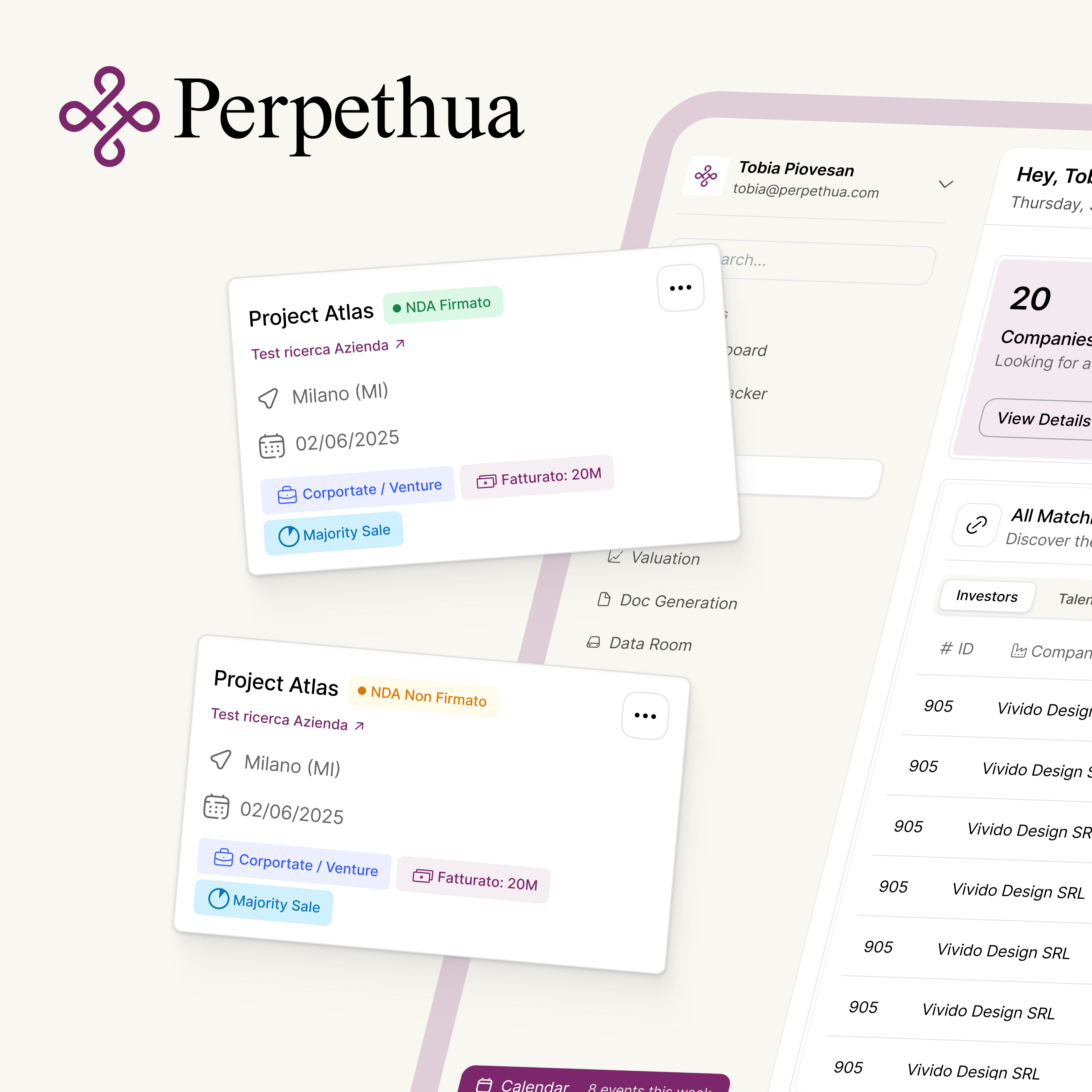
Mobile app screens showing a user profile with net worth, income and outcome stats, investment details, and a monthly budget input interface.

Vivido Method

Vivido Method

Vivido Method